Website for “Life at Öckeröarna” – Öckerö kommun
How do you translate a place brand into a digital experience that feels human, emotional, and authentic?
In this project, I worked as the responsible UX/UI Designer for the new website for “Life at Öckeröarna”, a place-brand initiative by Öckerö Municipality aimed at encouraging more people to move to, stay on, and build a life on the islands.
The core of the brand was positioning Öckeröarna as “a place for life”, a place where people can enjoy calmness, nature, and community while still being close to the energy and opportunities of Gothenburg. The visual identity and brand strategy were developed together with an external branding agency, while my focus was designing the digital experience and translating the brand into a clear, inspiring, and user-centered website.
The website is currently under development and is set to launch soon.
My role
I worked as the lead and responsible UX/UI Designer throughout the project.
My responsibilities included:
UX and UI design
Website structure and navigation
Information architecture
Mobile-first UX strategy
Accessibility and usability
Content hierarchy and page structures
UX writing and storytelling direction
Wireframes and hi-fi design
Design systems and reusable components
Translating the visual identity into a scalable digital experience
I worked closely with both the client and the team to ensure the website reflected the clients vision, goals and new brand while still functioning as a clear, accessible, and intuitive user experience.
The challenge
The goal was not to create a traditional municipal website focused on services and administration.
Instead, the challenge was to create a digital experience that could communicate what everyday life on Öckeröarna actually feels like,and inspire people to imagine a future there.
The platform needed to:
Encourage more people to move to the islands
Strengthen the sense of belonging for existing residents
Support long-term attraction and local growth
Showcase work opportunities and entrepreneurship
Communicate the balance between calm island life and proximity to the city of Gothenburg
Feel emotional, calm, modern, and authentic
Work primarily for mobile users arriving from campaigns and social media
One of the biggest challenges was balancing inspiration with usability. The experience needed to be highly visual, inspiring and story-driven without becoming overwhelming or difficult to navigate.
Goals
The project aimed to create a digital experience that would help visitors emotionally connect with life on the islands while also supporting practical decision-making around relocation and everyday life.
Key goals included:
Getting more people to move to Öckeröarna
Encouraging people to stay and build a long-term life on the islands
Creating a stronger emotional connection to the place brand
Communicating the unique balance between island life and city proximity
Designing a calm and intuitive user experience
Supporting storytelling and emotional engagement
Creating a mobile-first and accessible experience
Building a scalable structure for future communication and campaigns
Process
The project combined UX strategy, UI design, accessibility, and content-driven digital design.
A large part of the process focused on translating the new visual identity and brand platform into a cohesive web experience.
UX Strategy & information Architecture
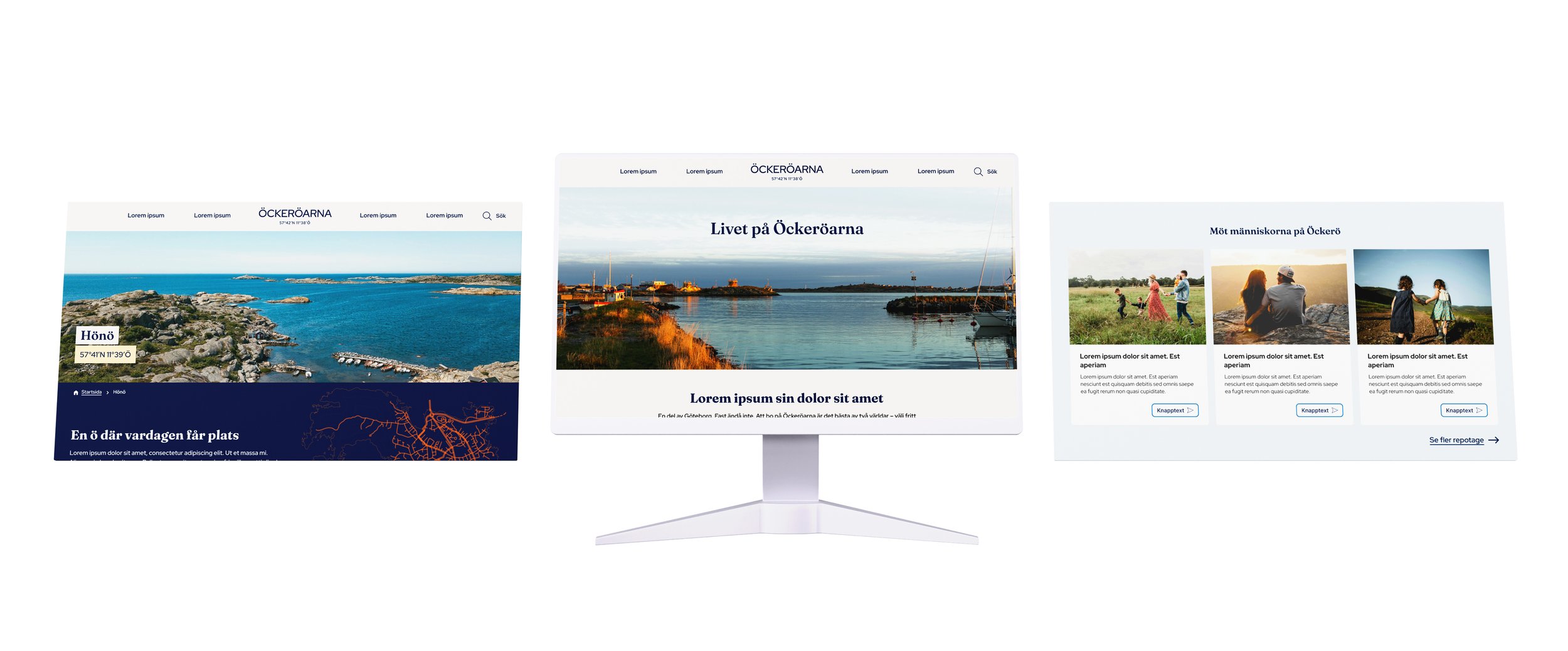
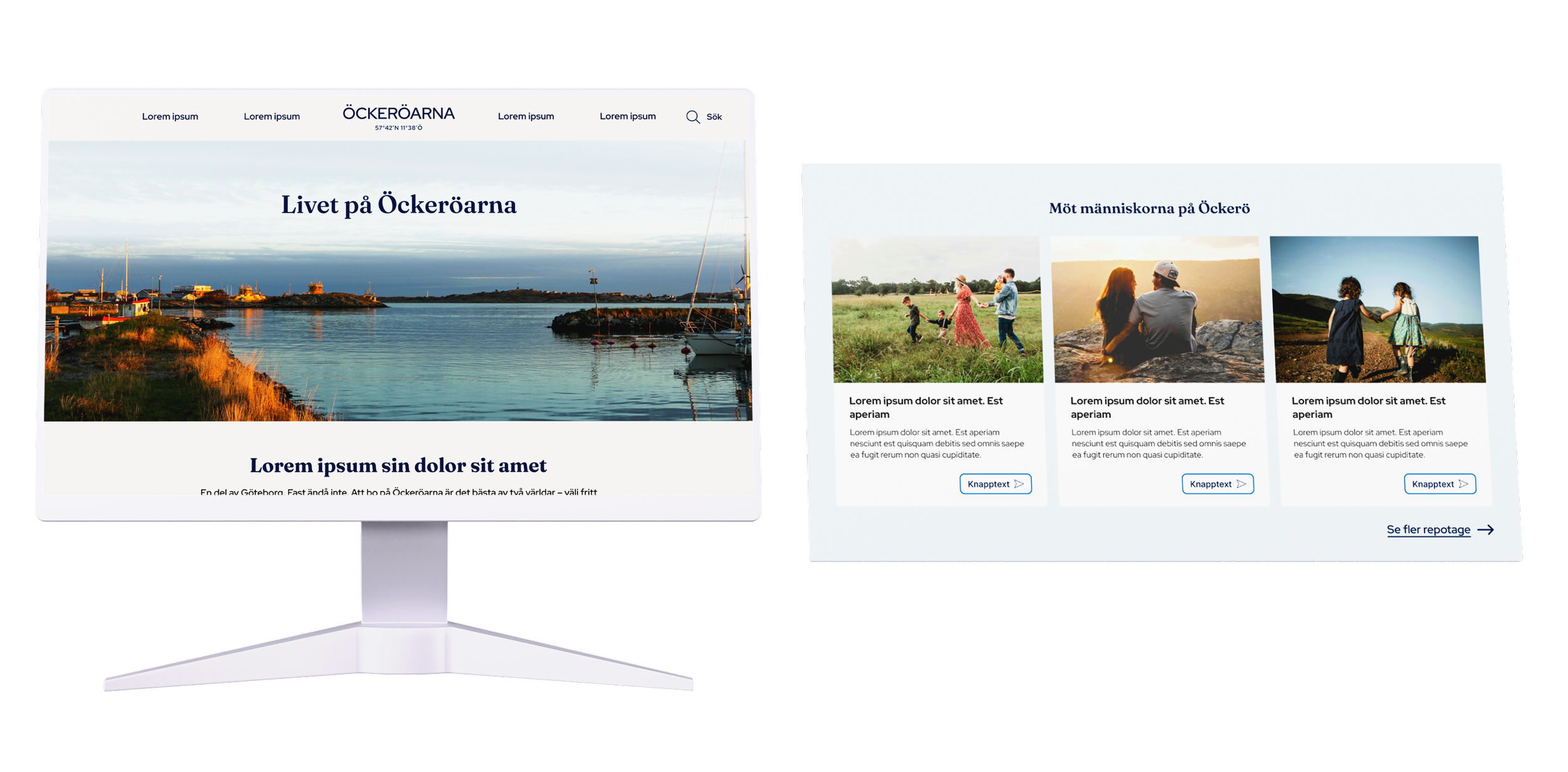
One of my main focuses was creating a structure that felt editorial and inspiring rather than administrative.
The navigation was intentionally designed around themes connected to how people explore and experience a place:
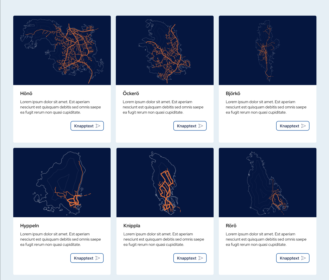
Våra öar (Our islands)
Vardagen (Everyday life)
Arbetet (Work & opportunities)
Besöka (Visit)
The structure relied heavily on visual storytelling, thematic landing pages, and reusable content blocks instead of deep and complex navigation systems.
I also worked with:
page structures and templates
navigation patterns
content hierarchy
CTA structures
mobile navigation
reusable UI components
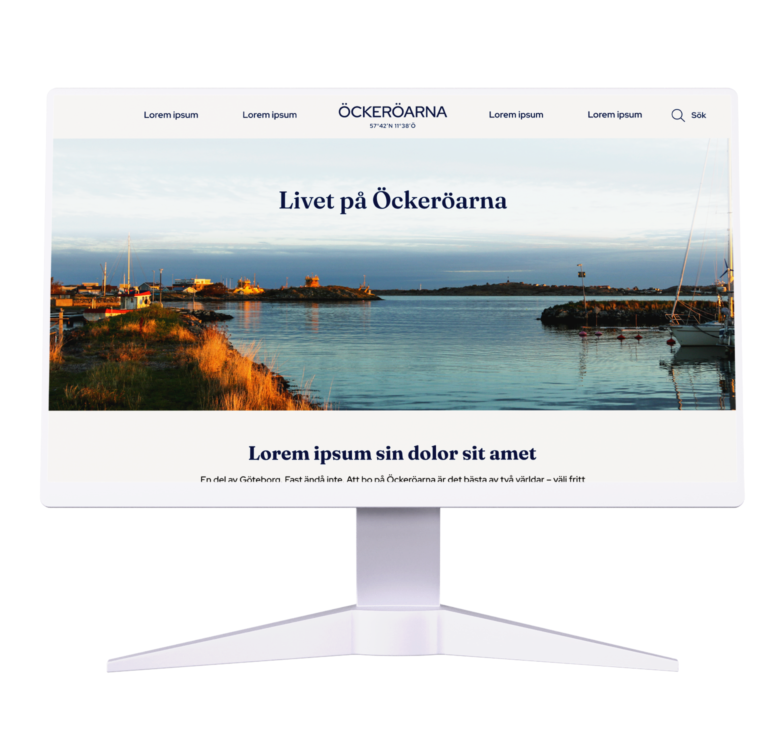
UI design & digital experience
The visual direction was inspired by the new visual identity system and focused on creating a calm, modern, and visually driven experience.
The UI principles focused on:
large and immersive imagery
generous whitespace
calm and clear layouts
strong visual hierarchy
consistent reusable components
editorial feeling rather than institutional structure
The website was designed to feel warm, human, and emotionally engaging while still maintaining accessibility and usability.
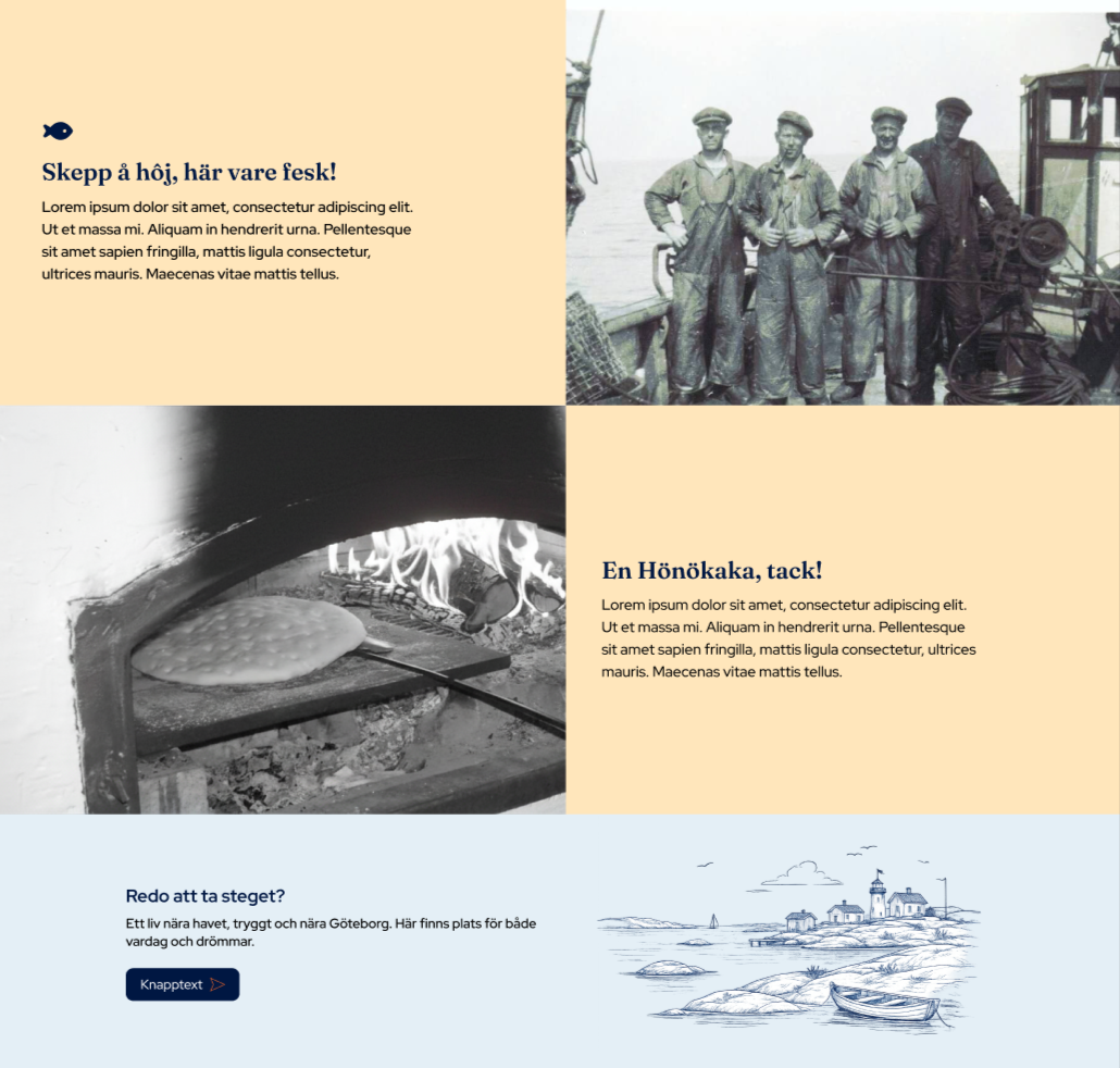
Storytelling & content experience
The content strategy focused on helping visitors imagine everyday life on the islands.
Instead of traditional informational content, the website uses storytelling and relatable situations to communicate the experience of living there. Examples included:
commuting by ferry while still being close to Gothenburg
children biking safely to school
local community, associations and belonging
everyday routines close to nature and the sea
balancing a slower lifestyle with access to city opportunities
The tone of voice was intentionally designed to feel:
human
calm
welcoming
authentic
rather than only informational or promotional.
Accessibility & mobile-first design
Since much of the traffic is expected to come from social media campaigns and mobile users, the entire experience was designed mobile-first from the beginning.
The work focused on:
clear navigation
touch-screen-friendly interactions
readable typography
strong contrast and hierarchy
scalable responsive layouts
accessible and reusable UI patterns
Accessibility was integrated from the start, and into both structure and visual design decisions throughout the project.
Key Insights
Several important insights shaped the final website:
People connect more strongly to stories and emotions than informative messaging or promotional content
Everyday life was more compelling than tourism-focused communication
The balance between island calmness and proximity to Gothenburg became a key differentiator
Simplicity and calmness strengthened the feeling of authenticity
Mobile-first thinking was essential for the target audience
Strong place branding requires consistency across content, design, and interaction

Solution
The result was a new website that combines storytelling, accessibility, and modern UX principles into a cohesive digital experience.
The solution included:
A clear and intuituve navigation structure
Image-driven and visual pages
Reusable and scalable content blocks (important for editors)
Mobile-first UX and UI design
Strong integration between branding and digital experience
A flexible structure for future storytelling and campaigns
Built in Sitevision
The website positions “Life at Öckeröarna” not only as a destination, but as a way of life.
Outcome
The project resulted in:
A fully designed and soon developed website ready for launch
A scalable and flexible system with components and content
A stronger and more cohesive digital identity
Mobile-first and accessibility-focused design principles
A platform supporting long-term attraction and place branding
A platform supporting editors
Key Learning
Designing digital experiences for places requires more than usability alone.
It is about combining UX, UI, emotion, storytelling, branding, and accessibility to create something people can genuinely imagine themselves being part of.
Fler wireframes