Pre-study & Design for Riksrevisionen
How do you make complex public information easier to understand, navigate, and access for everyone?

In this project, we worked on the pre-study and design for the new external website for the Swedish National Audit Office (Riksrevisionen). The goal was to modernize the existing website and create a clearer, more accessible, and more user-centered digital experience that better communicates the organization’s mission, audits, and public value.
I worked as one of two responsible UX/UI Designers throughout the project, contributing to research, workshops, UX strategy, wireframes, prototyping, and detailed UI design.
My Role
I worked as one of the lead UX/UI Designers throughout the project.
My responsibilities included:
UX and UI design
User research and analysis
Workshop facilitation
Effect mapping
Requirement and needs analysis
Information architecture and navigation
Wireframing and prototyping
Accessibility and responsive design
Design collaboration with developers and brand designers
Creating lo-fi and detailed UI concepts in Figma and FigJam
The project was carried out in close collaboration with both developers and stakeholders to ensure the solutions balanced user needs, technical feasibility, and organizational goals.
The Challenge
Riksrevisionen’s existing website needed modernization both visually and structurally in order to meet new expectations, requirements, and user needs.
The challenge was to create a website that could:
communicate complex information in a clearer and more accessible way
improve understanding of the organization’s work and audits
simplify navigation and information discovery
attract more job applicants
support accessible publishing of reports and audit results
create a modern, inclusive, and responsive experience
The website also needed to support large amounts of content and make complex public-sector information easier to navigate for a broad audience.
Goals
The project aimed to improve the overall user experience through clearer interfaces and simplified navigation structures.
Key goals included:
Providing clearer information about Riksrevisionen’s mission and audit work
Increasing understanding of the organization and its role in society
Improving accessibility and inclusive design
Creating a modern and responsive user experience
Supporting accessible publication of reports and results
Attracting more potential job applicants
Creating scalable structures for future content and development
Process
The project combined workshops, research, UX strategy, wireframing, prototyping, and collaborative design work.
The pre-study included the development of:
Wireframes and concepts for:
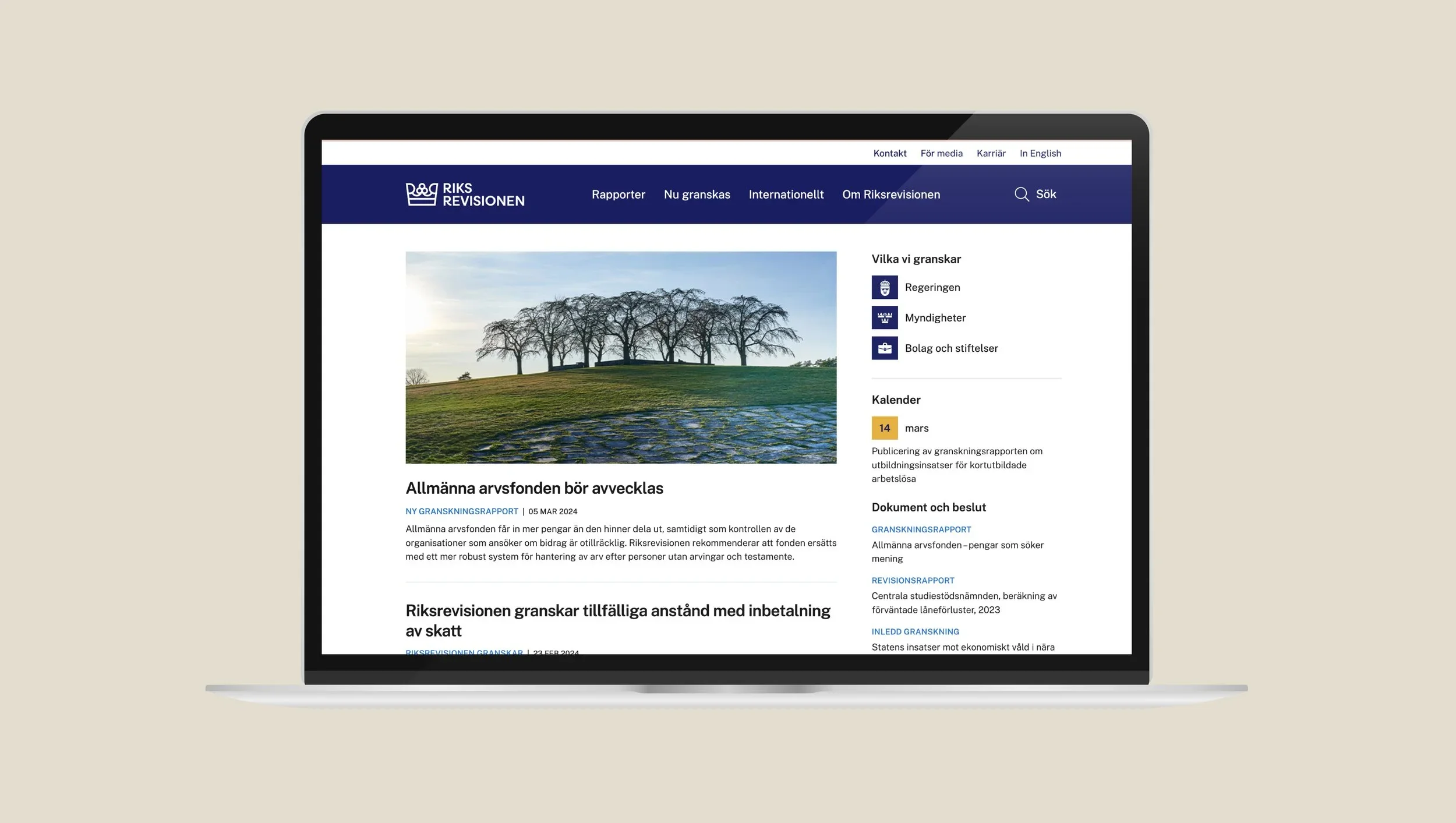
the homepage
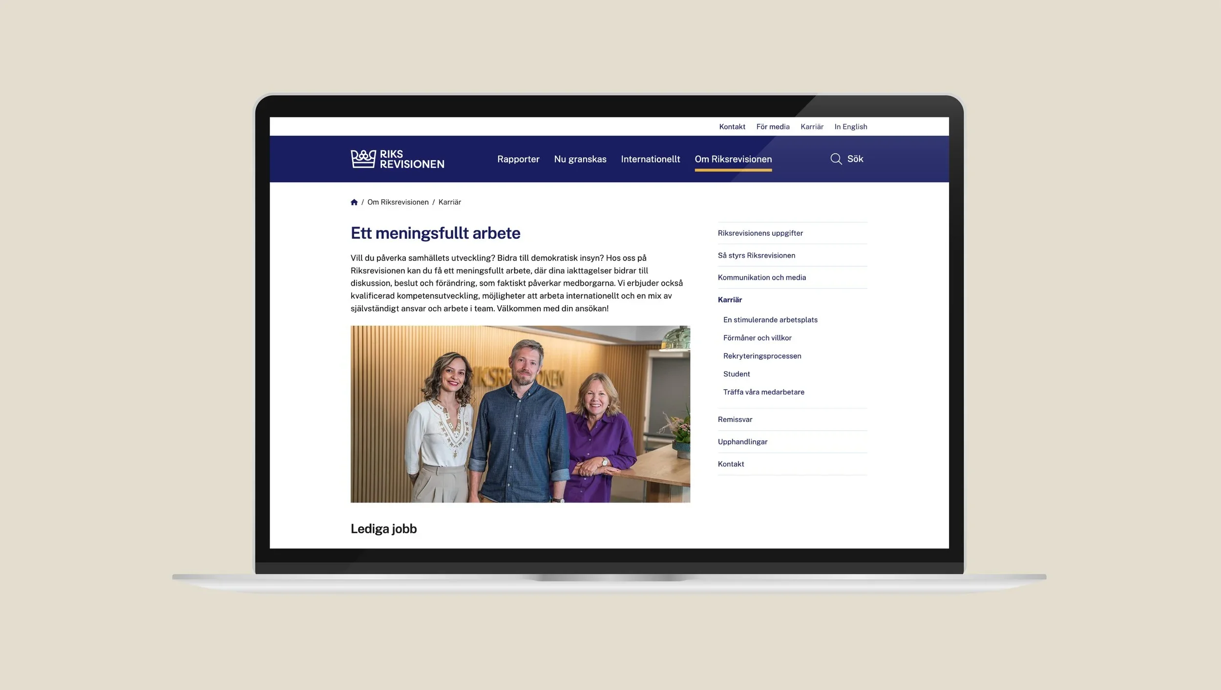
career pages
audit and review pages
Clickable wireframe prototypes
Navigation concepts including:
header
top navigation
side navigation
Sitemap proposals
Effect mapping
Planning and estimation for the continued development project
Throughout the process, we worked closely with developers to ensure that all design solutions were technically feasible and scalable.
We also collaborated with Consid’s brand agency Paradigm to develop a new visual identity and brand profile for Riksrevisionen, which later became the foundation for a new design system.
The work was highly iterative and included:
workshops and stakeholder alignment
requirement and needs analysis
collaborative design reviews
continuous feedback sessions
accessibility-focused design decisions
Solution
The result was a new design direction and UX foundation for Riksrevisionen’s future external website.
The solution focused on:
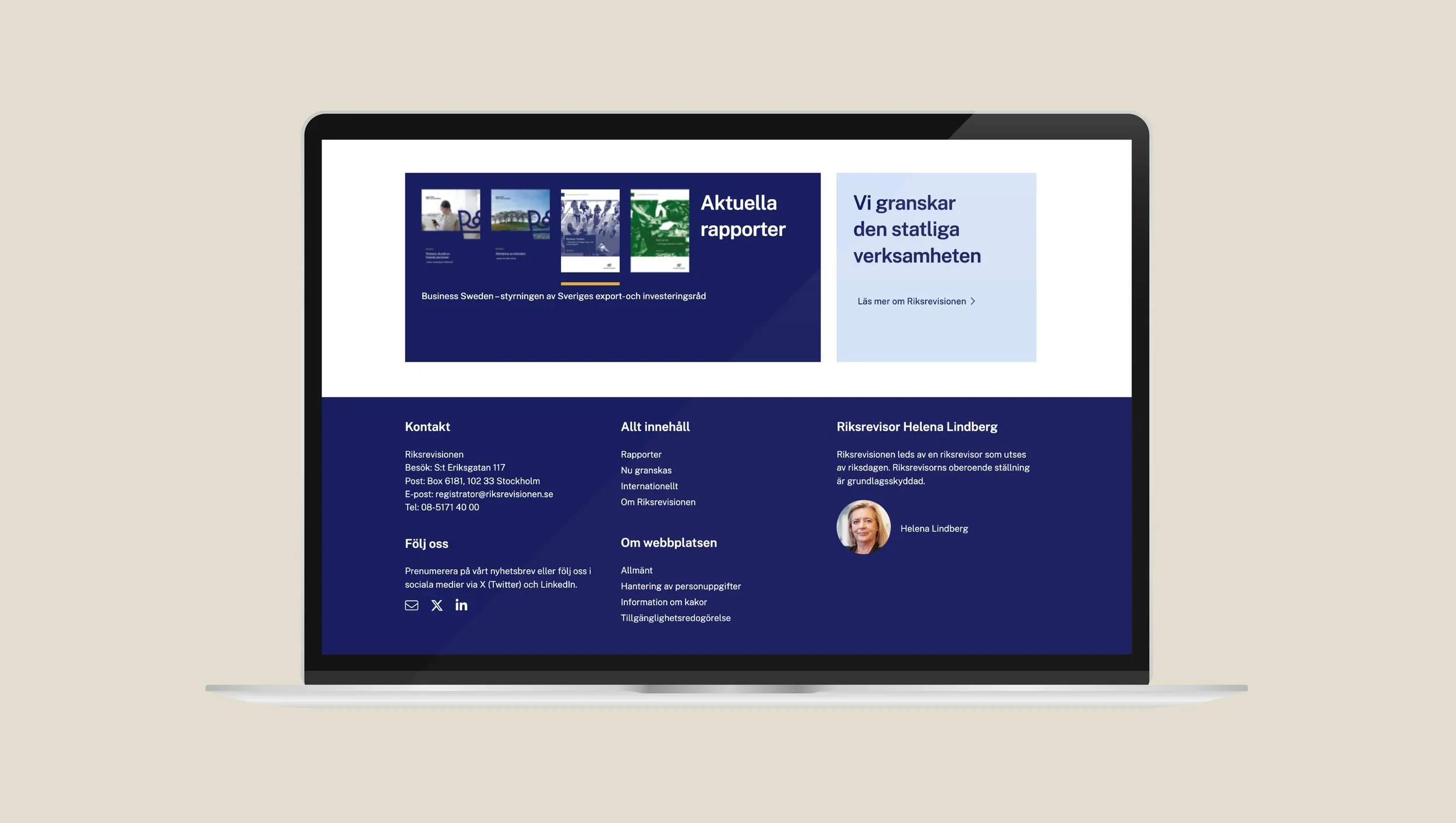
Simplified and clearer navigation
Improved structure for complex information
More accessible and readable content presentation
Responsive and mobile-friendly UX/UI design
Modern visual design aligned with the new brand identity
User-centered flows for audits, reports, and career content
Scalable structures and reusable design principles
The project resulted in a new website experience that made it easier for users to understand, navigate, and engage with the organization’s content and mission.
Outcome
The project resulted in:
A complete UX/UI pre-study and design foundation
Wireframes, prototypes, and detailed UI concepts
A clearer and more accessible information structure
A new visual direction and design system foundation
Planning and strategic direction for continued development
A modernized and more user-centered external website that was later launched
Key Learning
Designing for public-sector organizations requires balancing accessibility, transparency, structure, and trust.
This project strengthened my experience in translating complex institutional information into clear, intuitive, and user-centered digital experiences.
Our design solution